Assalamu’alaikum Wr. Wb.
Baru-baru ini ada bisnis pulsa yang sangat menguntungkan sekali. Menurut saya sih bisnisnya bisa memberikan manfaat bagi siapa saja.
Saya gak mau basa-basi, jadi langsung aja ke intinya aja yah.
Bisnis pulsa ini baru launching. Bisnis ini menawarkan pulsa yang begitu murah dari konter tempat anda membeli pulsa.
Selain itu, bisnis ini juga memberikan keuntungan kepada kita pada saat kita mendaftar.
Gambaran keuntungannya :
Biaya pendaftaran 100 ribu yang terdiri dari :
1. Keanggotaan SEUMUR HIDUP ( bisa diwariskan)
2. Kemudian mendapatkan saldo 100 ribu dan ditambah dengan bonus 5 ribu
Dapat dilihat dari rincian di atas, pertama kali kita mendaftar aja kita sudah mendapatkan bonus/keuntungan 5 ribu, apalagi kalo kita menjalankan bisnis tersebut.
Disini saya ingin menawarkan kepada Anda semua yang ingin gabung di bisnis ini dengan menjadi DOWNLINE atau MEMBER saya.
Apabila Anda menjadi downline atau member saya, Anda tidak akan rugi karena Anda akan mendapatkan KEUNTUNGAN yang lebih besar dari yang di berikan, antara lain :
1. Daftar 100 ribu
2. Keanggotaan seumur hidup ( bisa diwariskan )
3. Mendapat saldo 100 ribu + 5 ribu ( dari Admin )
4. Mendapat saldo 10 ribu ( dari saya sendiri )
Dengan demikian Anda mendapatkan untung yang begitu lumayanlah karena pertama kali daftar sudah mendapat saldo 115 ribu padahal biaya pendaftarannya saja 100 ribu.
Kemudian Anda juga bisa mendapatkan bonus yang lainnya sesuai dengan ketentuan Admin.
Anda juga bisa mendapatkan kesempatan untuk meraih mobil.
Mengapa Saya mengikuti bisnis ini?
Karena saya ingin mendapatkan teman yang lebih banyak dan mendapatkan penghasilan sendiri tanpa merepotkan orang tua.
Apabila Anda ingin menjadi downline saya, silahkan langsung hubungi 085641299340 / 085226232229.
INSYAALLAH ANDA AKAN SUKSES JIKA BERGABUNG DENGAN SAYA.
Wassalamu’alaikum Wr. Wb.
Selengkapnya...
SPONSOR


BISNIS AMPUH


Sunday, February 28, 2010
Sangat Untung
Saturday, February 27, 2010
Tips ngedapetin uang gratis dari SPONSOR
Hai semua.
Disini aku mau memberikan sedikit informasi yang mungkin sangat bermanfaat bagi kalian yang memiliki blog atau website.
Dengan adanya blog dan website, kita bisa mencari sponsor untuk blog atau website kita (alias nyari uang gratis).
Untuk mencari sponsor, kita bisa menggunakan fasilitas seperti AdsenseCamp, Kumpulblogger, Adsentra dan masih banyak lagi.
Cara kerjanya juga gak begitu sulit atau menyusahkan.
Kita cuma menampilkan script iklan yang telah disediakan oleh sponsor di blog atau website kita.
Tips dan Trik :
1. Pasang script iklan yang di sediakan oleh sponsor di blog kita sebanyak mungkin, agar iklan tersebut di klik sama pengunjung blog atau website kita.
2. Isi blog atau website kamu dengan artikel yang menarik dan berguna bagi pembacanya.
3. Agar cepat mendapatkan bayaran dari sponsor, Kamu bisa kerja sama dengan sesama blogger untuk mengeklik iklan yang ada di blog. ( intinya : kamu ngeklik iklan yang ada di blog/website partnermu dan partnermu ngeklik iklan di blogmu). Dengan demikian kita bisa sama-sama untung.
4. Cari partner sebanyak mungkin, karena semakin banyak partner semakin banyak peluang kamu ngedapetin bayaran yang gede.
PENTING : Jangan ngeklik iklan kamu sendiri, karena tidak di perbolehkan oleh pihak sponsor. Kalau kamu ketahuan ngeklik iklan sendiri, maka account kamu akan di hapus dari database.
So, HATI-HATI.
Semoga artikel ini sangat bermanfaat bagi kalian yang membacanya.
Apabila ada hal yang ingin di tanyakan, silahkan tulis di komentar.
Selengkapnya...
Friday, February 26, 2010
Comic Book Photo Effect
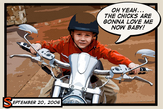
Introduction
IntroductionThis is a little technique I picked up at Photoshop World and have tweaked to my own preferences. Because each photo is different you’ll want to experiment a little with the settings to get your best result. I’ve found that although this technique can be used for most photos, there are certain ones that have a much more pleasing final result.Step 1
Although this effect can be applied to any image with decent results, I recommend starting with a fairly large photo (mine is 2160×1440px). We’ll be using the Color Halftone filter later in the lesson which has a 4 pixel minimum diameter and if your starting image is too small you’ll end up with more of a polka dot effect than anything resembling a comic book effect. Obviously I’ll have to resize my large image for each step in the tutorial and I’ve reiszed the .PSD download at the end of the lesson after applying the effects at the large scale.
All that being said, lets jump right in and build some setup layers. My photo is of my six year old nephew who was obviously getting a little too comfortable on uncle HERO’s Harley.
Step 2
The first order of business will be to duplicate the original photo layer by pressing Command-J (PC: Ctrl-J). We will be duplicating the layer a few times, so memorize the keyboard shortcut now. Name this new layer Soften.
Step 3
As it’s name implies, we will now soften this layer using a blur filter. Normally I prefer the Gaussian blur but for this tutorial we need the edges of our subject to stay crisp so we’ll be using the Surface Blur filter. Click Filter>Blur>Surface Blur from the main menu to bring up the Surface Blur dialog box. For this particular image size I’ve found that a Radius of 5 and a Threshold of 15 works nicely. Click OK when you’re done.
Step 4
For the moment we’re done with the Soften layer but we need the effect to also be visible on our next layer so lets duplicate the layer (I said we’d be doing it… do you remember the keyboard shortcut?). Call this new layer Desaturated and like it’s name implies we’ll be desaturating it. Choose Image>Adjustments>Desaturate to strip the color from the layer or simply use the keyboard shortcut Command-Shift-U (PC: Ctrl-Shift-U).
Step 5
Create a new layer by clicking the Create New Layer icon at the bottom of the layers palette. Name this layer Halftone.
Now we need to load the luminosity of our image as a selection and the easiest way to do this is to switch over to the Channels tab in the Layers palette and holding down the Command (PC: Ctrl) key while clicking on the RGB Channel’s layer icon.
Step 6
With the luminosity loaded as a selection, click back over to the Layers tab in the Layers palette and make sure that the new Halftone layer is selected. The Luminosity of the image is most simply described as the lightness of the image. What we actually want to do however is select the exact opposite (the darkness of the image), so lets invert the selection by choosing Select>Inverse from the main menu or by pressing the keyboard shortcut Command-Shift-I (PC: Ctrl-Shift-I).
Press the D key to set your foreground color to black and then fill the selection by pressing Option-Delete (PC: Alt-Backspace). Now we can release the selection (ie. deselect) by pressing Command-D (PC: Ctrl-D).
Step 7
Our setup is now complete and we can get to work on creating the effect. For the moment lets turn off the top two layers by clicking the little eye icon next to each in the layers palette and lets click on the Soften layer to select it as the layer we’ll be working on first.
Step 8
The Soften layer will be acting as the color layer for the comic book effect, but at the moment it contains far too much detail so lets use one of Photoshop’s Artistic filters to consolidate the color a little. From the main menu choose Filter>Artistic>Cutout.
The Filter window will appear with the Cutout settings visible. Set the Number of Levels to 8, the Edge Simplicity to 0 and the Edge Fidelity to 3. Click OK when you’re done.
(*note: If you have color bleed issues in this step, you can use the Posterize Edges filter instead with settings 2, 0, 2. This will yield a similar result while keeping color bleeding to a minimum.)
Step 9
Since the Cutout filter has dulled our color and typically comic book colors are quite vivid, lets press Command-J (PC: Ctrl-J) to duplicate the layer and then switch the new layer’s Blend Mode to Soft Light, effectively giving our colors more vibrance.
Step 10
We’re now done with the Soften layers so click the Desaturate layer to select it and then make it visible again by clicking the empty box next to the layer icon where we clicked the eye icon in Step 7.
Step 11
The Desaturate layer will now become the black outlines for our comic book effect. We will be using another of the Artistic filters called Poster Edges. From the main menu choose Filter>Artistic>Poster Edges to bring the Artistic filter window back up with the Poster Edges options visible. Set all 3 options to 1 and click OK.
Step 12
Lets now change the layer’s Blend Mode to Pin Light so we can get the color to show through from the layers behind while keeping the edge outlines we just created.
Step 13
We’re now done with the Desaturate layer, so lets click up to the Halftone layer and make it visible by clicking in the empty box to the left of the layer thumbnail just like we did with the Desaturate layer in Step 10.
This effect has a few steps so follow along closely. First lets load the layer as a selection by holding down the Command (PC: Ctrl) key and clicking on the layer thumbnail in the Layers palette.
Step 14
With the layer loaded as a selection click the Create Layer Mask icon at the bottom of the Layers palette to convert the selection to a layer mask.
Step 15
The layer mask on the Halftone layer should now be selected, you can tell because it will have small black brackets around it indicating that it is the selected working area of the layer.
Now it’s time to create the halftone dot pattern that will complete the comic book look for our photo. From the main menu choose Filter>Pixelate>Color Halftone. For the size of my image I’m going to use a setting of 8 Pixels for the Maximum Radius setting, depending on the size of your photo you may have to play with this value to get a result that looks right. The minimum pixel value for the Maximum Radius setting is 4 pixels which is why it is important to start with a large image to begin with, otherwise you’ll end up with something that looks like polka dots threw up all over it.
Step 16
Because we’re working on a layer mask and not directly on the layer this effect will look much better if we invert the layer mask. Do this now by simply pressing Command-I (PC: Ctrl-I).
We’re now done working with the layer mask, so lets click on the layer’s actual thumbnail to switch our working area back to the actual layer. You’ll notice that the brackets that were around the layer mask thumbnail before are now around the layer thumbnail now. Lets also change the way this layer interacts with the layers below by changing the layers Blend Mode to Soft Light allowing more of the color to come through while nicely retaining the halftone effect.
Step 17
This overall effect sometimes ends up producing an image that’s a little darker than I prefer, so to remedy this I’m going to add a Curves Adjustment layer by clicking on the Create New Fill or Adjustment Layer icon at the bottom of the layers palette (it’s the one that looks like a circle that’s split into two halves) and by choosing Curves from the menu. This will open up the Curves dialog box where I’ll grab the center point of the line and drag it up and to the left just a little to lighten the mid tones of the image while leaving the black and white points where they are.
Step 18
So my layers palette and image now look like this.
Step 19
Lets create a nice black outline around our photo. Create a new layer called Outline, fill the layer with the foreground color by pressing Option-Delete (PC: Atl-Backspace), don’t worry about the color because next we’ll lower it’s Fill opacity to 0% and add the following Stroke layer style to create the outline.
Step 20
Here’s my image with the Stroke applied.
Step 21
For my final image I added a few captions using a nice comic book font called Digital Strip which I’ve included in the tutorial download, or you can choose from a nice variety of other comic book fonts at DaFont.com.
Thursday, February 25, 2010
Jadwal UN Tahun 2010
Untuk Siswa/Siswi kelas XII SMA, berikut ini adalah jadwal UN Tahun 2010 :
Hari/Tanggal Waktu/Jam IPA IPS
SENIN, 22 - 3 - 2010 08.00 - 10.00 WIB Bhs. Indonesia Bhs. Indonesia
11.00 - 13.00 WIB Biologi Sosiologi
SELASA, 23 - 3 - 2010 08.00 - 10.00 WIB Bhs. Inggris Bhs. Inggris
RABU, 24 - 3 - 2010 08.00 - 10.00 WIB Matematika Matematika
Kamis, 25 - 3 - 2010 08.00 - 10.00 WIB Fisika Geografi
Jum'at, 26 - 3 - 2010 08.00 - 10.00 WIB Kimia Ekonomi
SEMANGAT !!
Tuesday, February 23, 2010
10 Universitas Terbaik di Indonesia
Berikut ini merupakan 10 Perguruan Tinggi yang Terbaik di Indonesia, antara lain :
1 Universitas Gajah Mada
2 Institute Teknologi Bandung
3 Universitas Indonesia
4 Universitas Pendidikan Indonesia
5 Universitas Kristen Petra
6 Universitas Pertanian Bogor
7 Sekolah Tinggi Teknologi Telkom
8 Universitas Brawijaya
9 Universitas Gunadarma
10 Institute Sepuluh November Surabaya
Untuk lebih mengetahui salah satu Perguruan Tinggi di atas, kalian bisa buka sendiri website Perguruan Tinggi tersebut.
Selengkapnya...
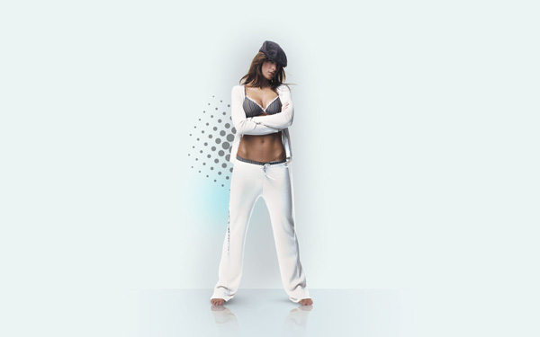
Professional Image Decoration using Photoshop
Then choose the Rectangle Tool (U) to draw a rectangle, like the next one:
Set Fill to 0% for this layer in Layers panel:
Select Add a layer style from bottom part of the Layers panel and click to Gradient Overlay:
Click in the color bar to open the Gradient Editor and set the color stops as shown. Click OK to close the Gradient Editor dialog box.
We’ve got the next floor:
Find a stock photo with a model represented on it, I used this photo from deviantart. I would like to thank the author of this photo:
Remove the background using your favorite tools like Pen Tool (P), Magic Wand Tool (W), Magnetic Lasso (L) or even a simple Filter>Extract. Make a copy of this layer (Ctrl+J), click the visibility button on this copy, we’ll need this layer later:
Click on the bottom part of the Layers’ panel on the next icon Create new fill or adjustment layer and select Levels to make some color corrections
Raise the contrast of the picture:
Put the mouse cursor between the layers and hold on the Alt button while clicking on the left button. The top layer will be transformed into a mask:
Next we’ll add another adjustment layer. Click on the bottom part of the Layers’ panel on the Create new fill or adjustment layer and select Hue/Saturation:
Reduce the color saturation:
Transform it into a mask too. Click on this layer on the Layers’ panel, select the mask and using a brush from the Brush Tool (B) of black color paint the opened zones (skin) on the girl’s body:
Add another adjustment layer. Click on the bottom part of the Layers’ panel on the Create new fill or adjustment layer and select Curves:
Set the options for raising the contrast. Paint the body’s zones in the mask too and a little on the girl’s clothes, only on those places with a high contrast.
This is the result we should get:
Make the girl’s reflection on the floor. Let’s activate the copy of the girl’s layer and turn it around, applying Free Transform (Ctrl+T). Choose the Eraser Tool (E) to erase the same places demonstrated below:
Then select a Soft Round brush of black color with the Opacity of 20% and represent a shadow on a new layer:
The brush’s settings:
Create a new layer, representing here the shadow around the girl. Choose the same options applied before for the Soft Round brush, but enlarge the brush’s size, using the button ].
Create a new layer select a Soft Round brush and insert here a spot of the color #6DCFF6. Opacity - 20%.
Create a new file with the size 500px by 500px (RGB color mode) at a resolution of 72 pixels/inch. Select the Soft Round brush of black color and set the next shown options for it:
Let’s put a brushstroke, like the next one:
Then choose Filter>Pixelate>Color halftone and set the next demonstrated settings:
It’s the result we’ll get on this stage:
Select this layer and place it on a new layer on our basic document, changing the Blending Mode to Darker Color and set Fill to 40%.
Selengkapnya...
Monday, February 22, 2010
Lighting Effects in Photoshop

Preparations:
We will need a nice model image and some vector curves.
There are plenty to be found at Vecteezy and here is where I got mine.
All rights of these resources belong to their respective owners.
Step 1 – Setting Up Background:
Create a document of size 750 by 550px.
Set your foreground color to #505050 and background color to #000000.
Drag a Radial Gradient at the position shown in the diagram.
Step 2 – Cropping the Model:
Crop out the model with Pen tool. You can check out this post to find out how. Go to Image > Adjustments > Levels to tone it darker.
Open up the vector curves you downloaded from Vecteezy in Illustrator. Select the curves and press Ctrl+C. Switch back to Photoshop and press Ctrl-V. Select Paste As Smart Object.
Postion the curves as shown on the left.
Step 3 – Glowing Curves:
Duplicate the vector curves layer. Right-click on this new layer and choose Rasterize.
Go to Filter > Blur > Gaussian Blur with 2px. Set the Blending Mode for this layer to Color Dodge.
With Soft Eraser tool of 300px, erase those parts that are further away from the model.
Step 4 – Adding Color Light:
Create a new layer between the curves and the model.
Make a circular selection with Elliptical Marquee tool at the center. Go to Select > Modify > Feather with 30px.
Fill this selection with #D200FF. Change the Blending Mode to Screen and opacity to 40%.
Step 5 – Adding More Lights:
Using the same method in Step 4, create 2 more colored lights above the model layer.
The colors used are #F6FF00 and #00A2FF. Change the Blending Mode for these two layers to Overlay and opacity to 60%.
Step 6 – Creating Smoke:
Create a new layer below the model and draw a large rectangle with color #FFFFFF.
Go to Filter > Liquify. Using the Forward Warp tool with size 300px, push the white rectangle any way you like to form a wavy look.
Step 7 – Glowing Smoke:
Select the Smudge tool with size 200px, smudge the white wave earlier around the model. You can pull and push the waves around in any manner.
You can start to see nice glow of colors blending around the blurred edges.
Step 8 – Adding Point Lights:
Create a new layer on top of the rest.
Select a Soft Brush tool with #FFFFFF. Paint some white dots of various sizes along the edge of the model.
Step 9 – Stroking Paths:
Create another new layer on top. Use the Pen tool and make one or two paths similar to the one I had in the diagram.
Set the foreground color to #FFFFFF. Select the Brush tool and reduce the size to 3px. Right-click on the path(s) you drawn and choose Stroke Path.
Check on Simulate Pressure then OK.
Step 10 – Glowing Lines:
Right-click on the lines layer and choose Blending Options > Outer Glow. Set the Blend Mode to Linear Dodge (Add), Size to 6px and Color to #00D2FF. The rest leave as default.
Click here to view the final image.
TERIMA KASIH
Selengkapnya...
Perbedaan Windows Vista dengan Windows Seven
Perbedaan Windows Vista dengan Windows Seven
WINDOWS SEVEN
Sejarah Windows 7: Windows 7 sebelumnya dikenal dengan sebutan Blackcomb dan Vienna, Windows ini memiliki kennel NT versi 6.2 SP2 dari Windows Server 2008 Windows 7 memiliki keamanan dan fitur yang baru. Windows 7 adalah jenis dari Windows Server 2008 SP2. Windows ini dirilis pada tanggal 22 Oktober 2009, fitur – fitur windows 7 adalah: Jump List, Taskbar yang membuka program dengan tampilan kecil, Windows Media Player 12, Internet Explorer 8, dan lain-lain.
windows 7 ada 6 tipe yaitu
* Windows 7 Starter
* Windows 7 Home Basic
* Windows 7 Home Premium
* Windows 7 Professional
* Windows 7 Ultimate
* Windows 7 Enterprise
Perbedaan windows 7(Seven):
* Fitur Gadgertnya bisa diatur tidak seperti windows vista menempatkan gadget ditempat nya
* Cara mengistal seven tidak begitu lama (setiap Kompi Berbeda-beda loe)
* Tampilannya tidak jauh beda dengan vista
* Kecepatan Akses Windows 7 Lebih Cepat
WINDOWS VISTA
Sejarah Vista: Windows Vista dirilis pada tanggal 30 November 2006, bagi kalangan bisnis sementara untuk kalangan pengguna rumahan dirilis pada tanggal 30 Januari 2007, Windows Vista memang dicanangkan agar memiliki keamanan yang lebih tangguh dibandingkan dengan versi-versi sebelumnya, aplikasi yang baru (seperti halnya Windows Calendar, Windows DVD Maker dan beberapa game baru termasuk Chess Titans, Mahjong, dan Purble Place). Selain itu, Windows Vista juga menawarkan versi Microsoft Internet Explorer yang lebih aman, serta Windows Media Player versi yang Terbaru, Windows Vista menggunakan nomor versi 6.0
Type Windows Vista ada 6 Yaitu:
* Windows Vista Starter
* Windows Vista Home Basic
* Windows Vista Home Premium
* Windows Vista Business
* Windows Vista Enterprise
* Windows Vista Ultimate
Perbedaan windows Vista:
* Fitur Gadgertnya bisa tidak bisa diatur seperti windows 7
* Cara mengistal Vista begitu lama (setiap Kompi Berbeda-beda loe)
* Tampilannya tidak jauh beda dengan Seven
* Windows Vista juga memperkenalkan fitur grafik yang jauh lebih “memikat”, yang disebut dengan Windows Aero GUI
Selengkapnya...